
Activity and Process
Our team is really good at research. I mean, when I say, really good, I really mean it. We can go through tons and tons of articles in matter of a couple of days. But what happens next? Where can we go from there? How do all these individual pieces of knowledge contribute to the bigger picture of project? With hundred of notes in our Mendeley Account, we were starting to think we will never be able to effectively realize the value of research we have done. However, with our dedication to using the best practices in the design and research process, we decided to try an Affinity Mapping Exercise—a method that Karen Holtzblatt (InContext Design) puts so much emphasis on as a primary method of consolidating research findings.
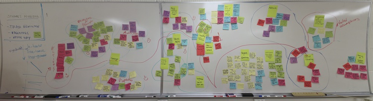
We started by individually going through the papers we had read, summarizing the highlights on Post-Its and explaining them to the other team members as they put the Post-It on the board. We filled out multiple whiteboards and got kicked out of two different libraries because they were closing. In the end, we had identified major themes on our Post-Its and had started to categorize them into those themes (clusters). We then did a pass through the information on the board, eliminating redundant facts and pieces of information that were way outside of our scope or irrelevant to our current direction.
Having organized our Post-Its into clusters, we then started to find connections and overlays between the different clusters. Specifically, we worked to establish relationships between the clusters of 3D gesture technologies and the clusters of publishing industry information.
With two giant whiteboards full of information, we had managed to boil down and categorize our research findings into clusters that we could work to dig deeper or dismiss as irrelevant to our current focus.
Activity Findings
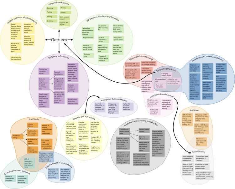
We formed groups around problems, types, and properties of gesture technology; print and digital media; mobile platforms; content delivery; storytelling platforms; the focus of media coverage; user-contributed content; revenue and advertising; business models; audience; inter-business sharing of content; and social sharing. After looking at these groups, we felt that there were opportunities in the following areas:
- The intersection of social-sharing, storytelling platforms, reader-generated content, and gesture technology
- Relationships between print media, digital media, and the changing focus of coverage
- Consumers, news media, and content creation (from stakeholder map) For better access and retrieval of this valuable research artifact, we decided to digitize this big diagram using OmniGraffle. Below is the digital version of our affinity diagram.
Implications for Design
Having concluded our primary phase of secondary research, we are planning on using this diagram as a useful way of determining and guiding our primary research activities. Furthermore, having a consolidated source of current trends, information, and technology has helped us greatly in achieving a common mental model and understanding of the problem space we are working with.