
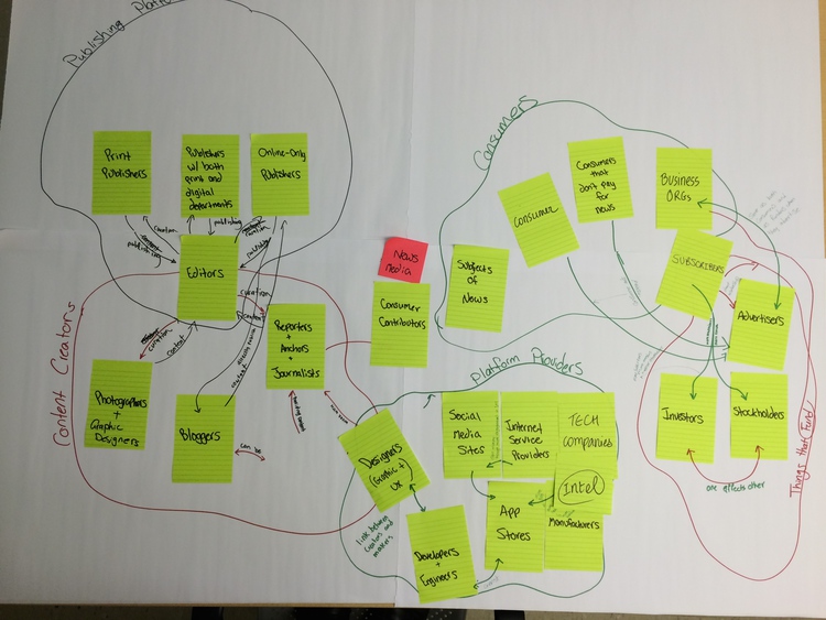
Activity and Process
We chose to do a stakeholder map because we wanted to better understand the relationships between the stakeholders and how value passes between them. More specifically, we wanted to see what values in addition to money were passing between stakeholders. We started by writing all the stakeholders we could think of on post-it notes. Once that was finished, we grouped related post-it notes on a large sheet of butcher paper. When we had managed to group all of the post-it notes, we came up with overarching group titles for each cluster of stakeholders. The main groups were determined to be publishing platforms, consumers, content creators, platform providers, and funders. The final step was to determine how value passed between the large groups of stakeholders as well as between individual stakeholders.
Key Observations and Takeaways
Looking back, this exercise was a little surprising in how similar to an affinity diagram it turned out to be. Instead of research insights, we had stakeholders, and instead of themes, we had stakeholder groups. One of the challenges we had with this exercise was actually determining the difference between content creators and consumers. In one sense, the news media companies and employees were the main content creators, but news consumers could leave comments on that content, or start debates about the content among friends. Hence, consumers became somewhat of a secondary content creator. In the end, we decided that the comments and debates were one way that consumers passed value back to the media companies.
This exercise was also successful because the entire team was contributing to it at the same time. We all came up with stakeholders and agreed on groupings and relationships, which helped to get us all on the same page and see the big picture. We had also decided to set a 20 minute time limit on this exercise in light of our remaining tasks at the time, and were able to successfully complete the stakeholder map in this timeframe. Consequently, we discovered that time limits in certain situations can help us to make decisions and be more efficient with our time.
One additional takeaway came out of our effort to create a digital illustration of our stakeholder map. Creating this illustration gave us a chance to follow graphic design principles, resulting in better organization, better visual enclosure of the groups, and neatly drawn and labelled interactions between stakeholders. Our program director and others felt that all these improvements greatly added to their comprehension of the map. We found the illustrated version to be much more useful to us as well, so it’s likely that we’ll be doing many more “cleaned up” versions of our frameworking in the future.
Implications for Design and Moving Forward
The creation of the stakeholder map ultimately helped us to see how the different stakeholder groups rely on each other, and what they expect from each other in terms of value. For instance, we determined that the content creators relied on funders such as advertisers for revenue, which allowed them to present content to consumers and (hopefully) turn a number of those consumers into subscribers, who would in turn create more revenue for the content creators. This map also allowed us to discover that many of the relationships between stakeholders are complex, which in turn helped us to narrow which relationships we wanted to focus on for our next steps. At the end of the exercise, we had decided to focus on the relationship between content creators and consumers. This focus led us to come up with a tentative design question, and will serve to narrow our future research and prototyping activities.
